
GUMTREE RESPONSIVE
Gumtree Small Jobs - anytime, on any device
After completing the Small Jobs project, further assistance was required to make the site responsive. The duration of this project was one week.
Discover and Define
I had a great understanding of people’s needs from the desktop testing undertaken in the Small Jobs project, but how would this translate to different devices? I thought the best place to start was online – researching people’s behaviours. My focus then moved to Robert and Tessa’s journey. What would their experiences be if they were using different devices?The key takeaways from my research were the need for speed and space to reduce errors. In other words, how do we ensure the site is accessible to anyone, at anytime, on any device?
Develop and Deliver
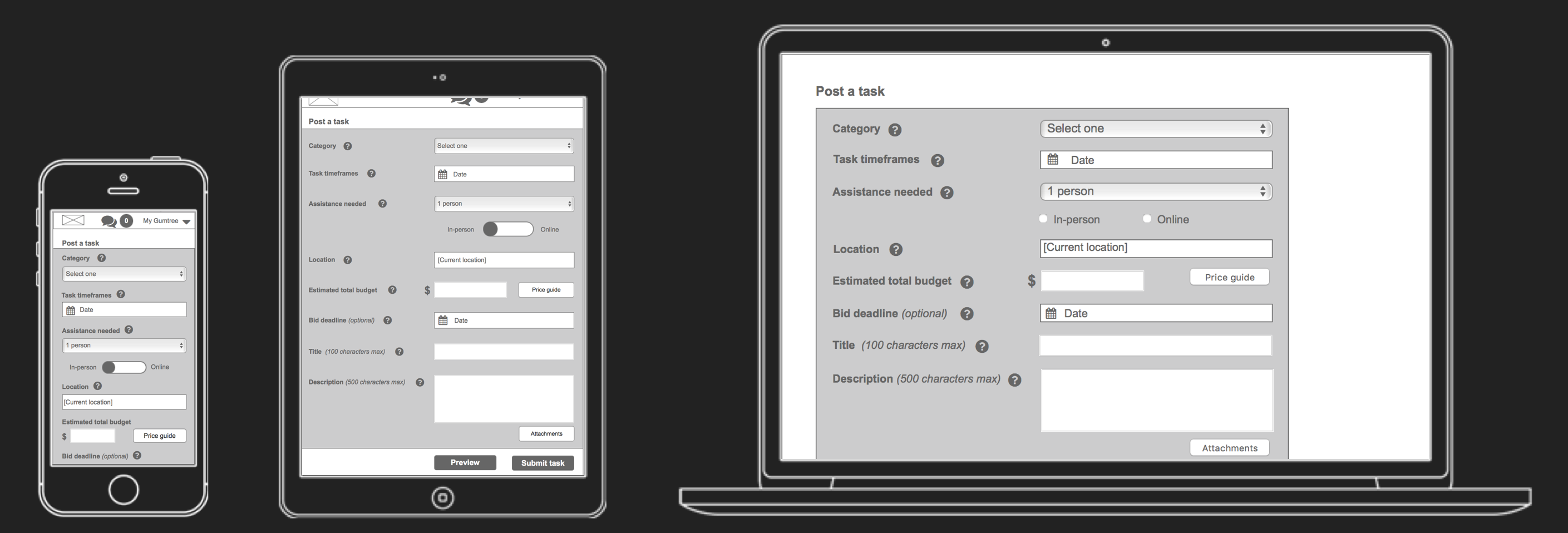
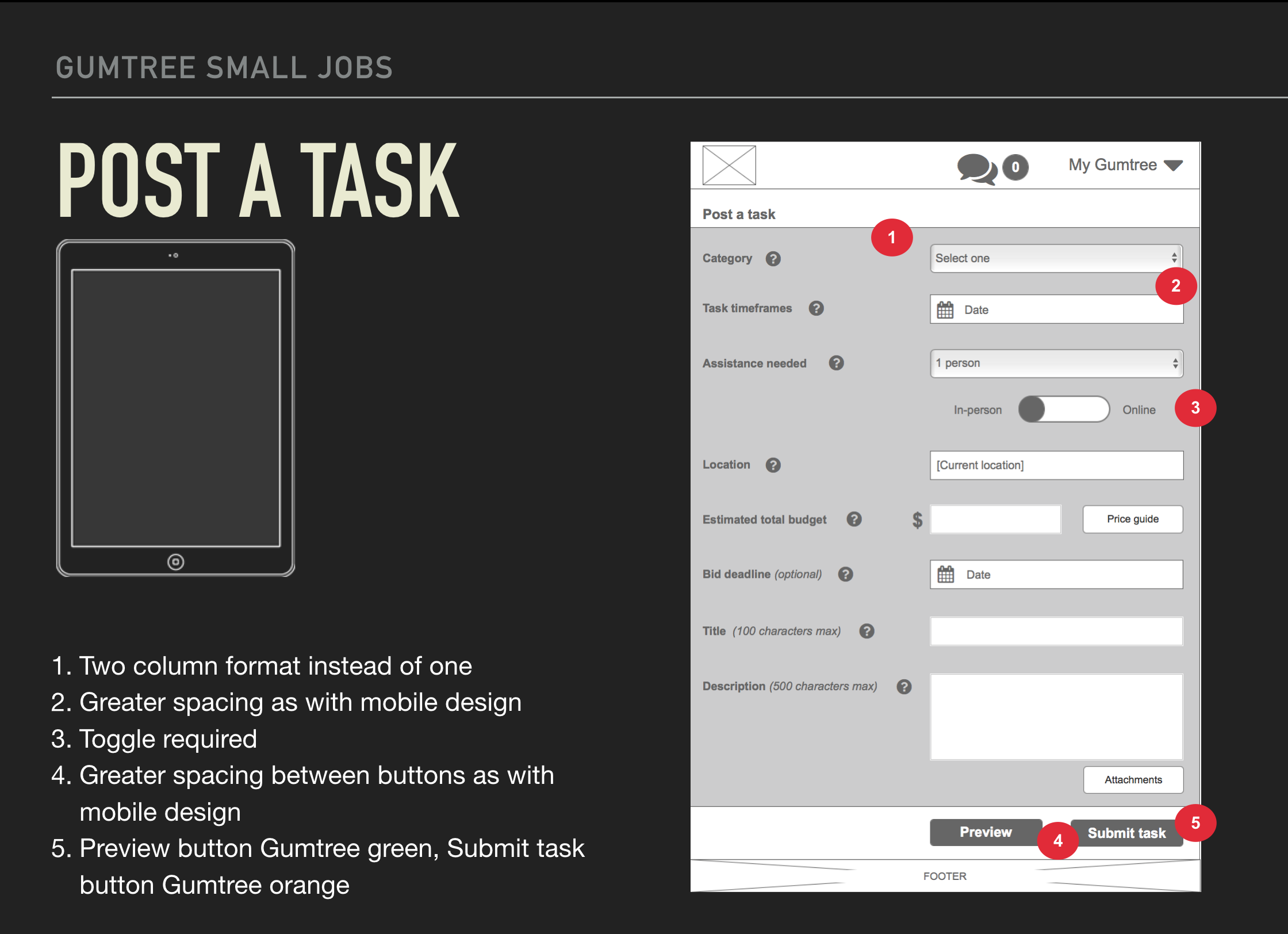
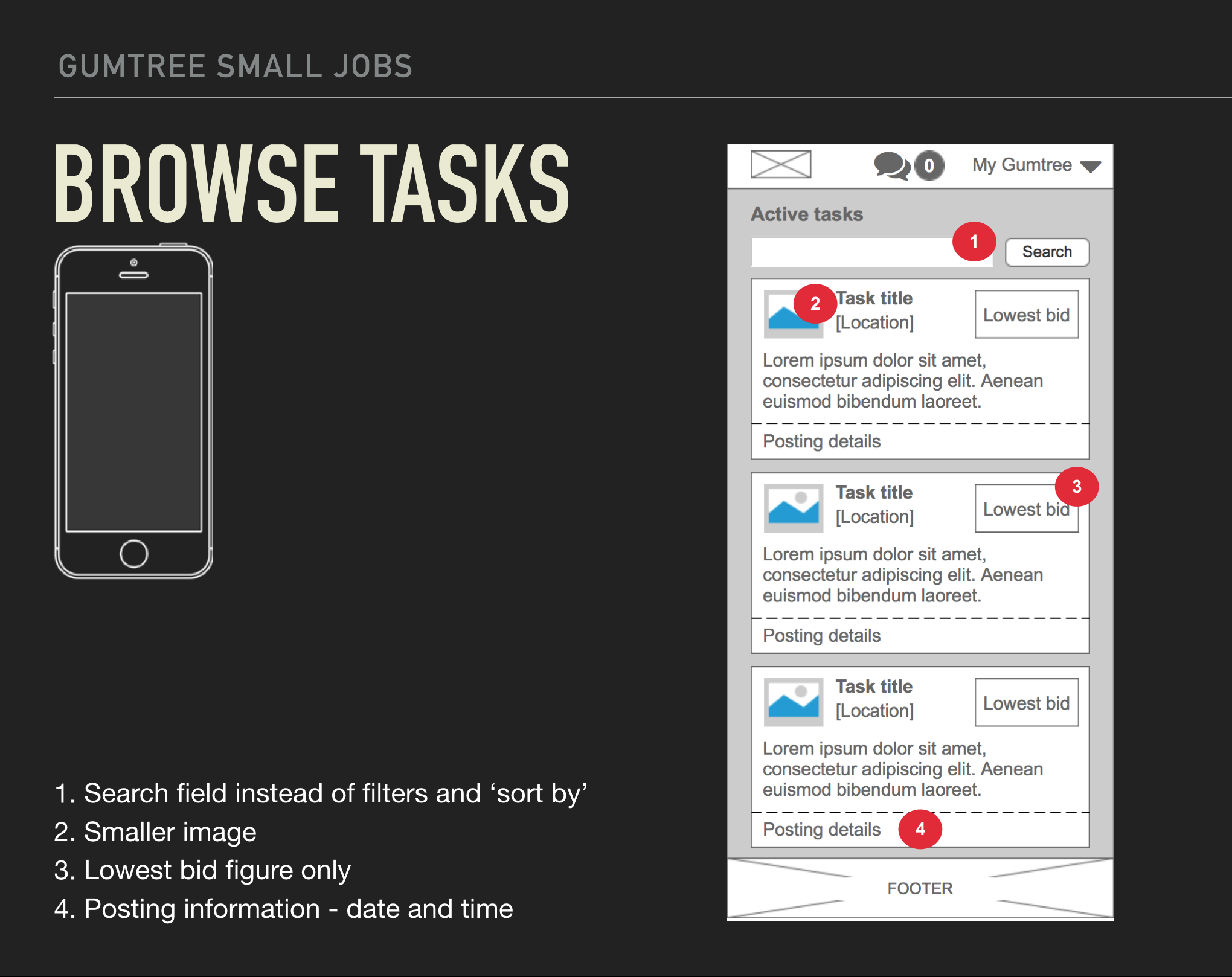
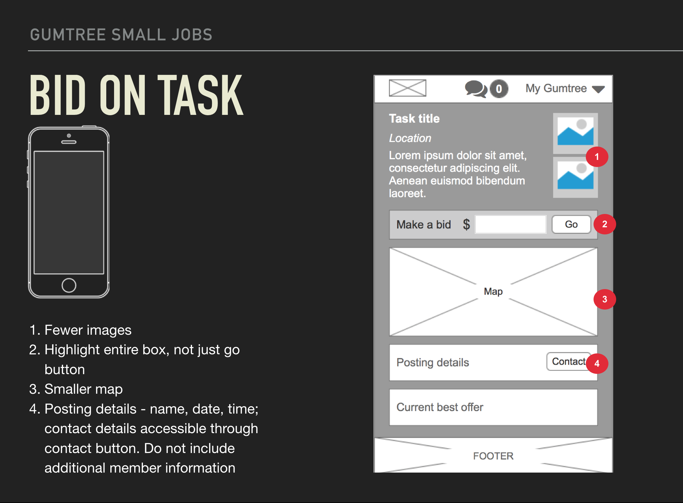
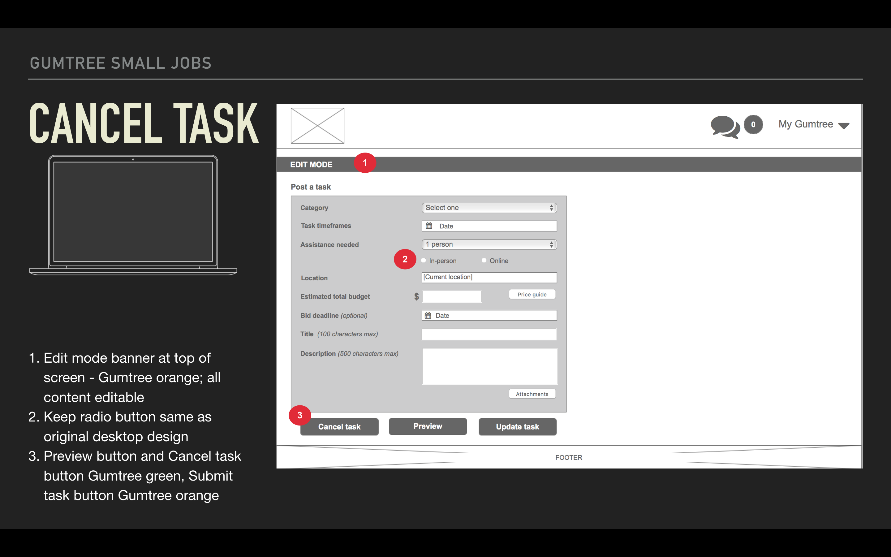
To capture the journeys of Robert and Tessa using different devices, I iterated the user journey and created the wireframes.
The first insight was discovered before testing even began. While extensive testing was undertaken for desktop previously, further edits were needed to make it consistent with other devices, when designing mobile first.
The interesting thing discovered during the testing of mobiles and tablets, was a lack of consistency. Some users wanted to see everything you would on a desktop, others wanted the bare minimum to reduce the amount of time needed. There was consistency with the format changes and interestingly, the Gumtree winners functionality was suggested by one user. The wireframes were marked up with annotations after testing.
Lessons learnt
- It is difficult to establish trends when testing mobile and tablet devices, making it all the more important to have the users properly defined. It makes sense that companies provide a mobile site and a link to their full site to accommodate just that.
- Designing mobile first allows you to ensure consistency across all devices without additional rework that would occur if designing desktop first.
This work was undertaken to complement the Gumtree Small Jobs project.